A More Efficient Use of Space in a Home Full of Teenagers
Remodeling a Kitchen in Bay Village
A custom-designed home as unique as the family itself.
This homeowner, now raising teenagers, found herself in cluttered mayhem with a small and sectioned off kitchen, a closed off and unused dining room, and an overall inefficient layout that was not suitable for their lifestyle.
The busy family desired a home that would cater to their need for meals on the go, a quiet space for school or business work, and better promotion of social interaction when entertaining friends and family. This led to the idea to expand the main living and kitchen areas while maintaining separated, productive living space.
The Client’s Needs and Desires
A More Effective Use of Space
To create an efficient use of space throughout while maintaining separate work and living areas.
Improve Traffic Flow
To remove friction between room transitions and improve the overall traffic flow throughout.
Addition of Eating Area
Because the kitchen expanded into the dining room, there was a need for a dine in/ seating within the new space.
To include a dine in/seating area within the new space since the kitchen was to be expanded.
Updated Appearance
To create a fluid and up to date aesthetic throughout the entire first floor.
Effective Storage Solutions
To provide creative storage that appeals to the aesthetic while achieving efficiency and effectiveness.
Improved Lighting Throughout
The original layout did not provide ample lighting and would need to be addressed.
To address the current lack of lighting and improve to ensure ample lighting throughout.
Increased Natural Lighting
To bring and maximize the natural light throughout the entire first floor.
A Space for Entertaining and a Space for Privacy
To designate a space for entertaining while still allowing the option for privacy on the same floor.
Before:
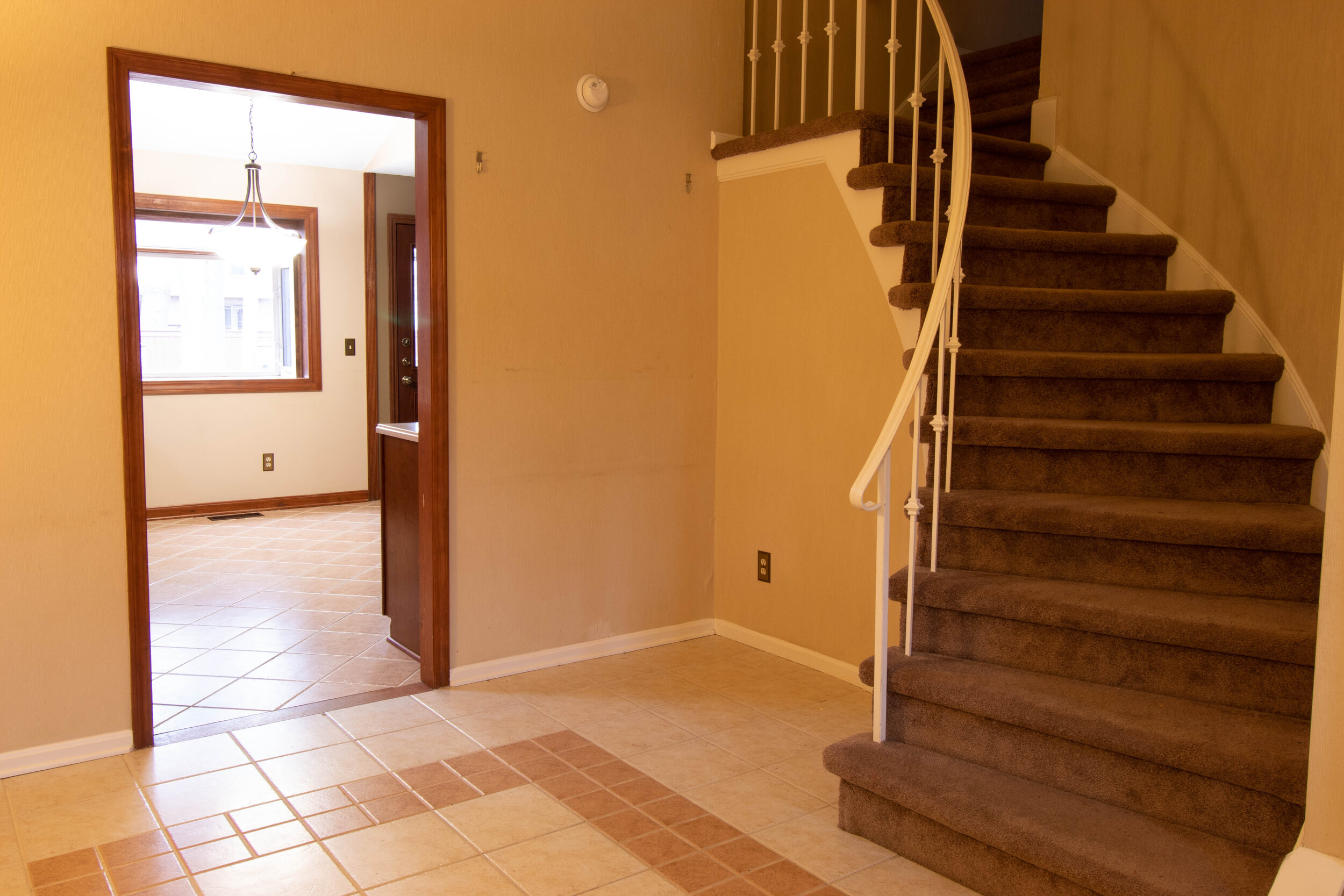
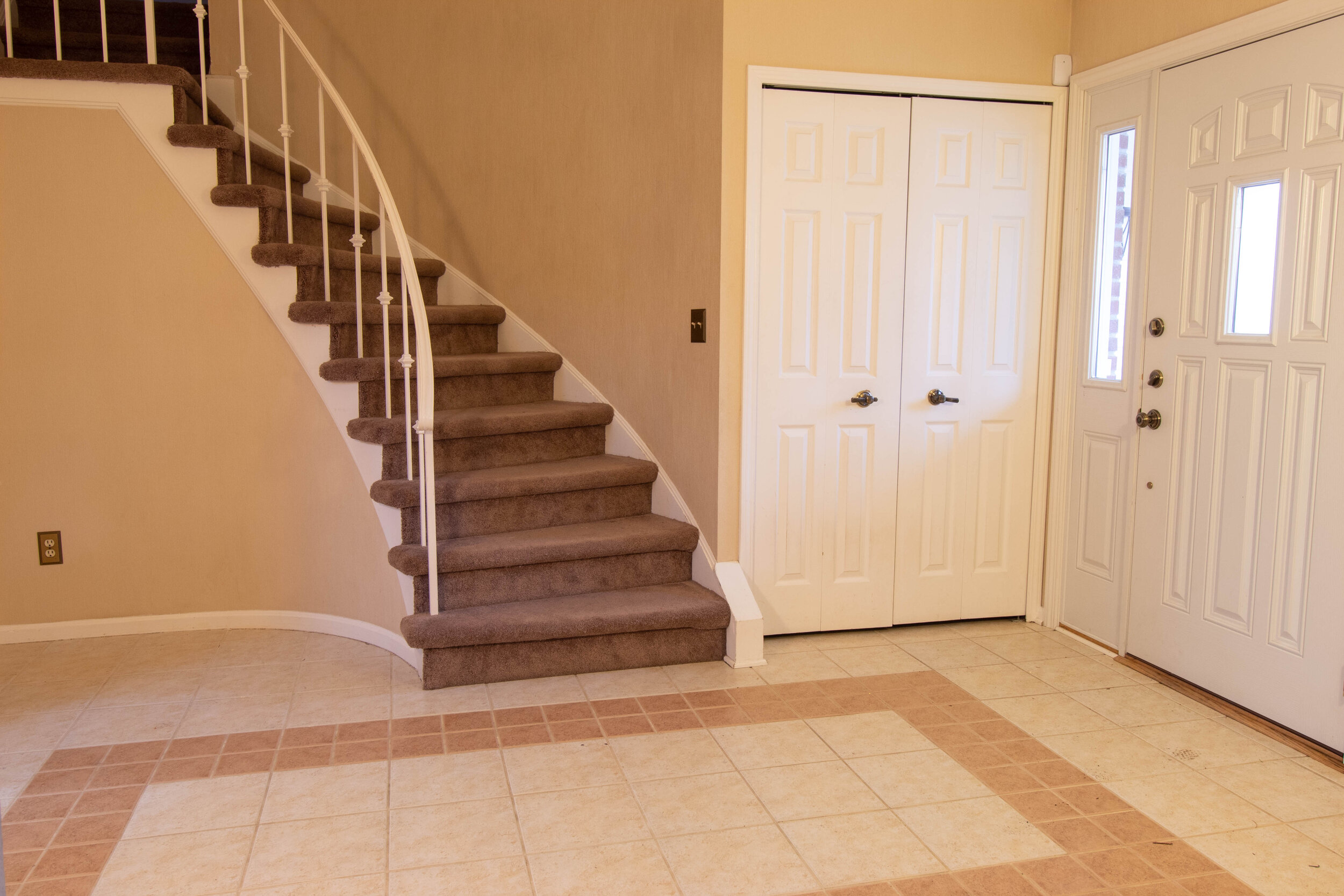
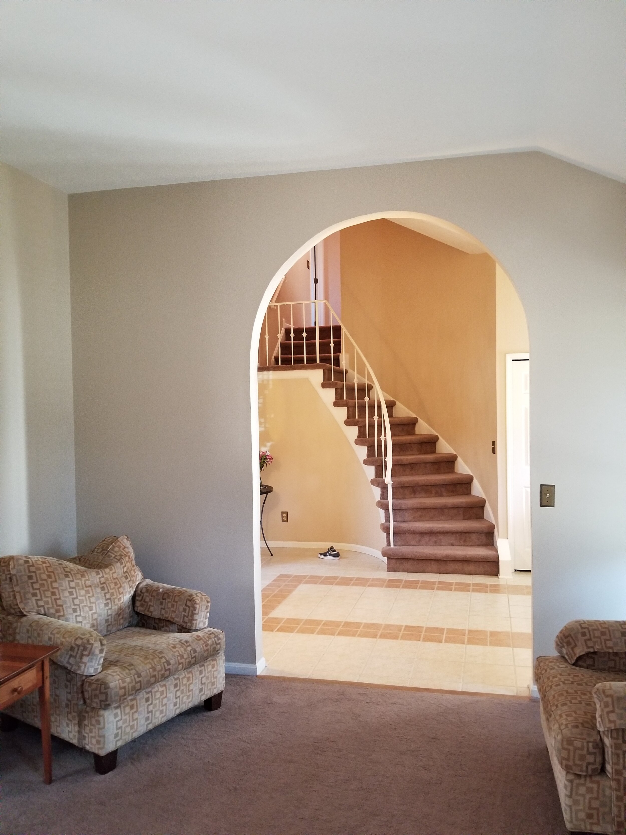
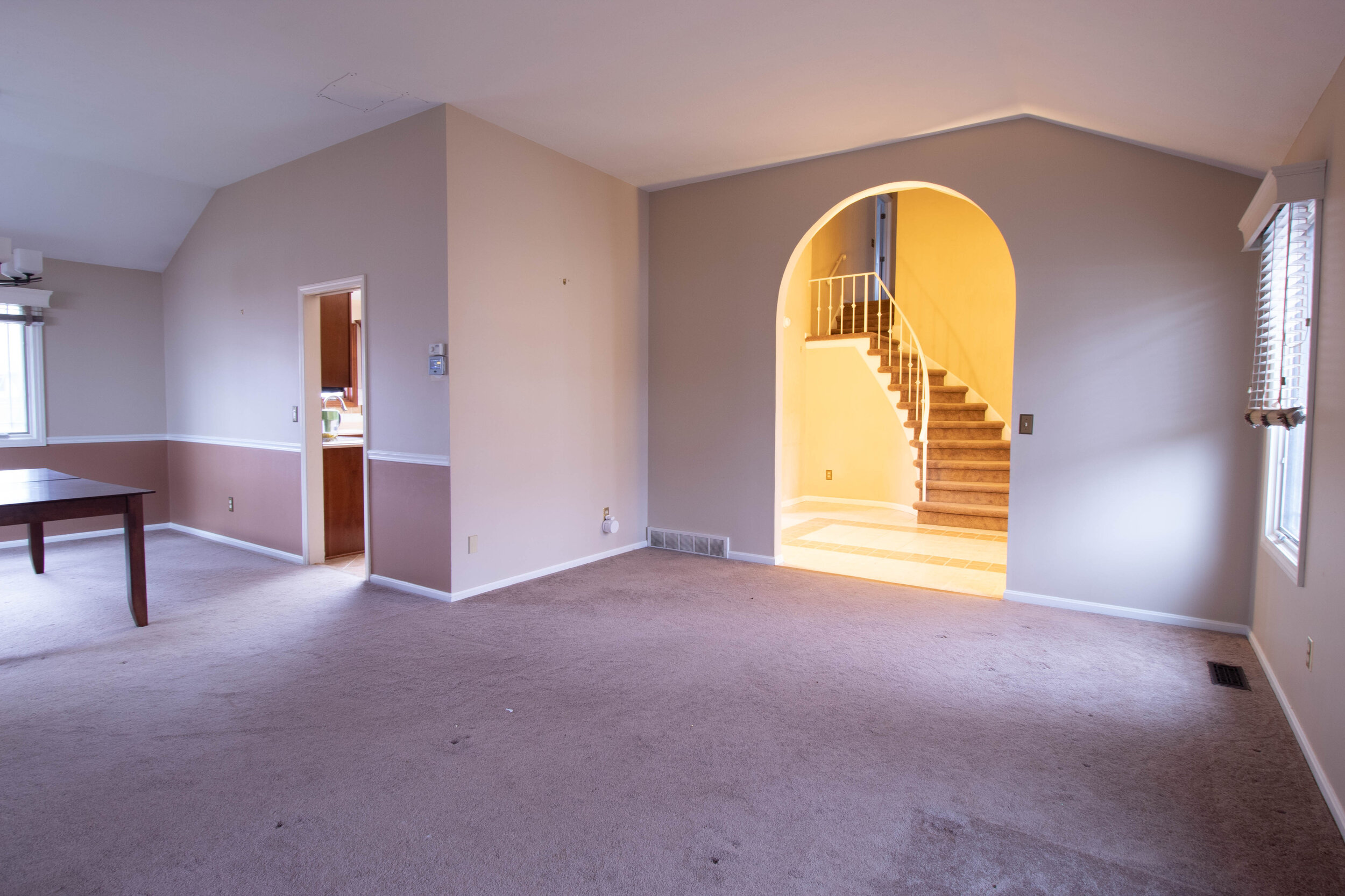
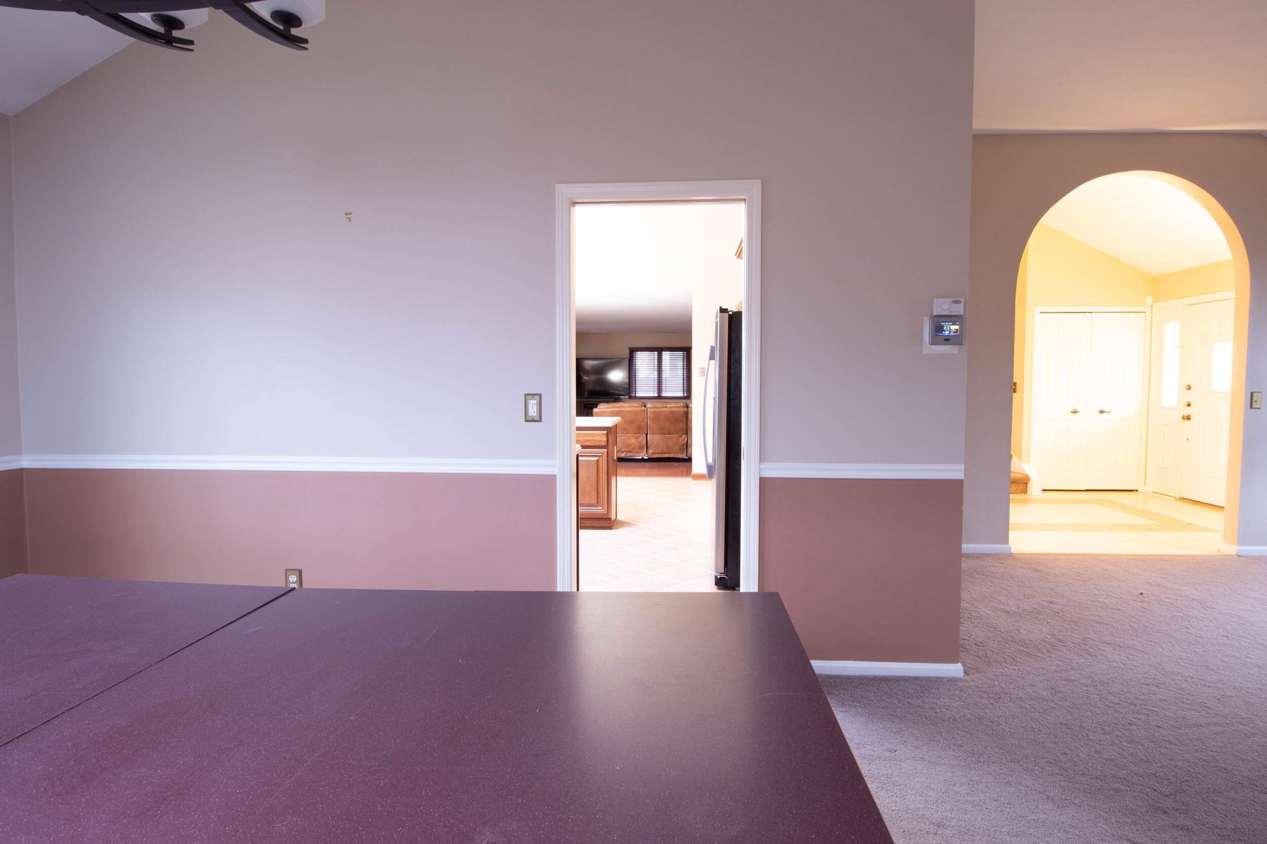
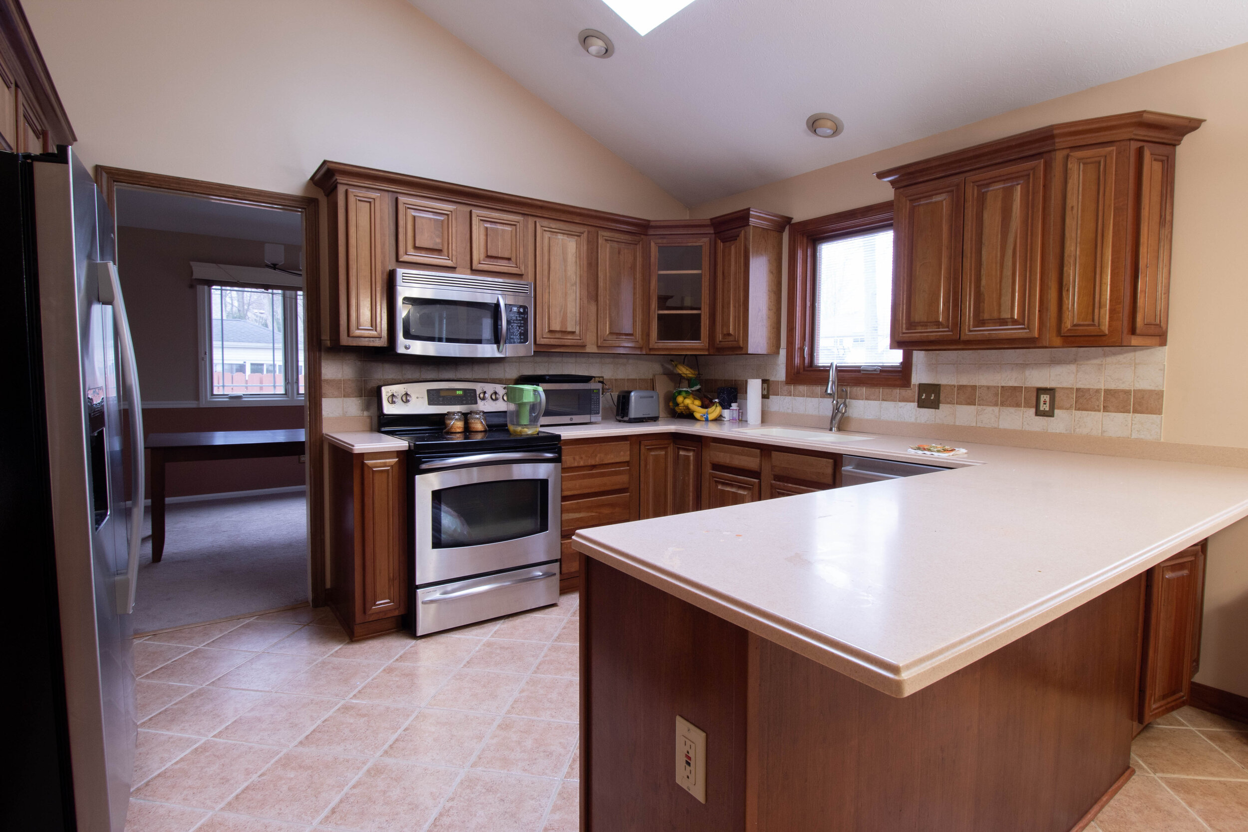
The existing floor plan featured an outdated foyer with a misplaced arch that led to an unused formal family and dining room. Through a crammed doorway was the entrance into the small kitchen. The awkward placement of the refrigerator blocked the walkway when in use, creating a highly inefficient working area. The cabinetry layout formed an L shape, closing off the kitchen and creating a small, awkward dining area before entering the living room. In the laundry room poorly placed doors for both the laundry room and basement opened into each other, causing friction when moving through the space.
The New Plan:
The new floorplan removed the wall to the formal dining room, allowing to expand the kitchen and create a semi-open concept in the home.
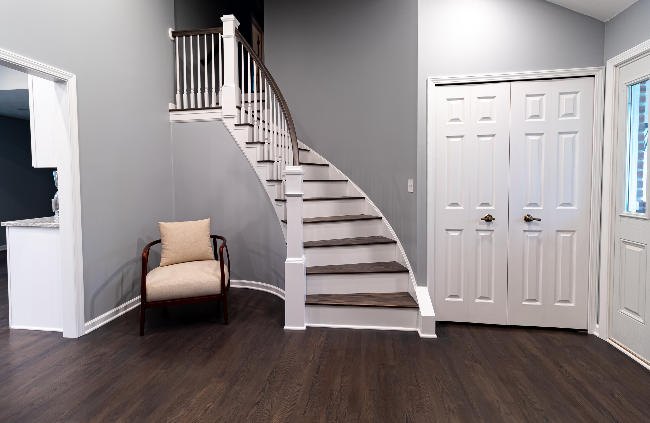
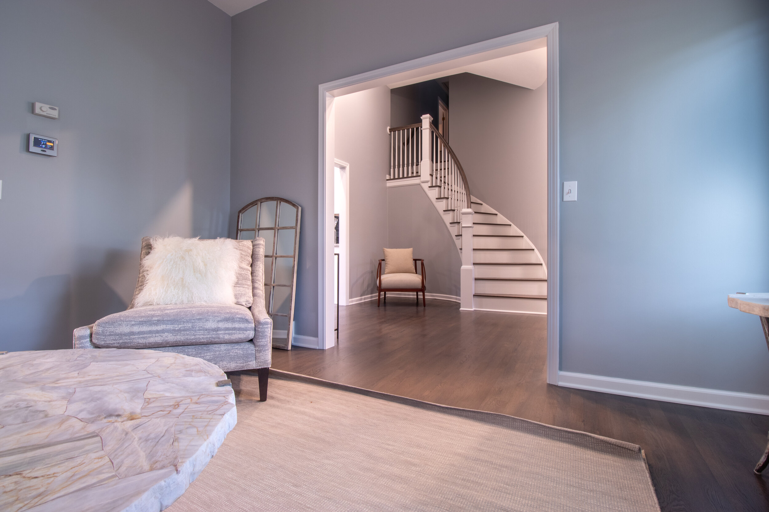
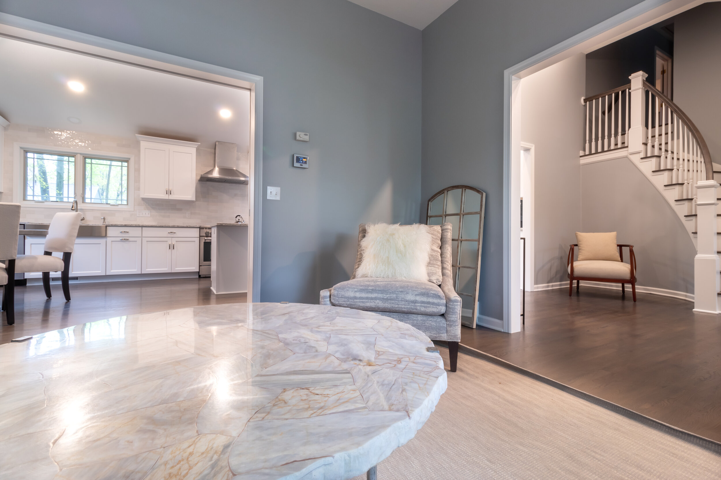
Flooring was replaced throughout the entire first floor, and updated stair treads adorn the curved staircase leading to the 2nd floor. The unsightly archway in the foyer was updated with a squared off walkway, and new molding was replaced throughout. This not only brought an updated look to the home, but also created continuity within each space.
Addressing the Client’s needs.
A more effective use of space.
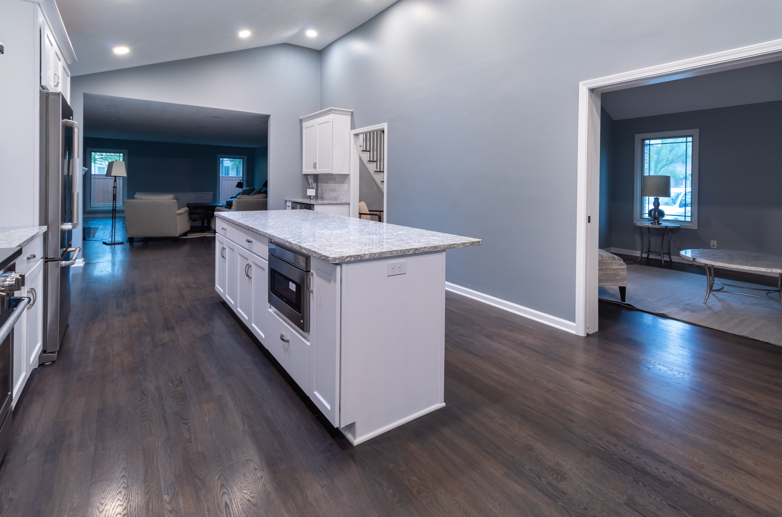
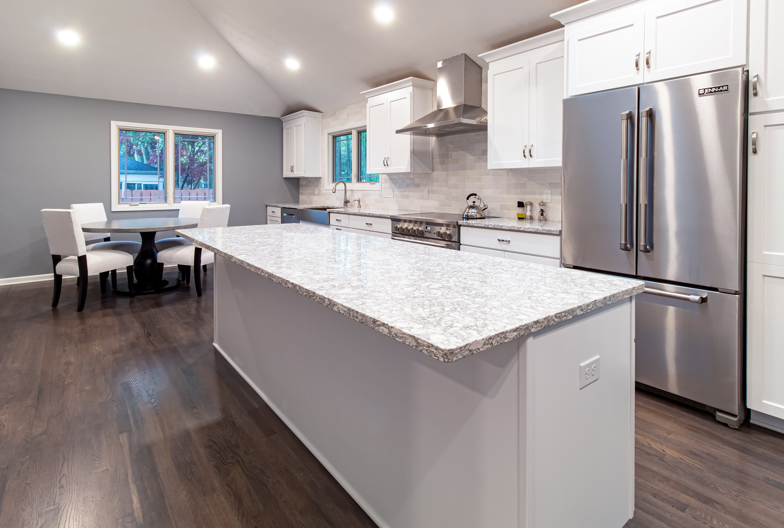
By removing the wall to expose the formal dining area, an additional 130 sq. ft. of space was utilized to expand the kitchen. In addition, the decision to create a wall and pocket door to the family room allowed for the option of private space without interrupting the flow of the main areas of the home.
Improve traffic flow.
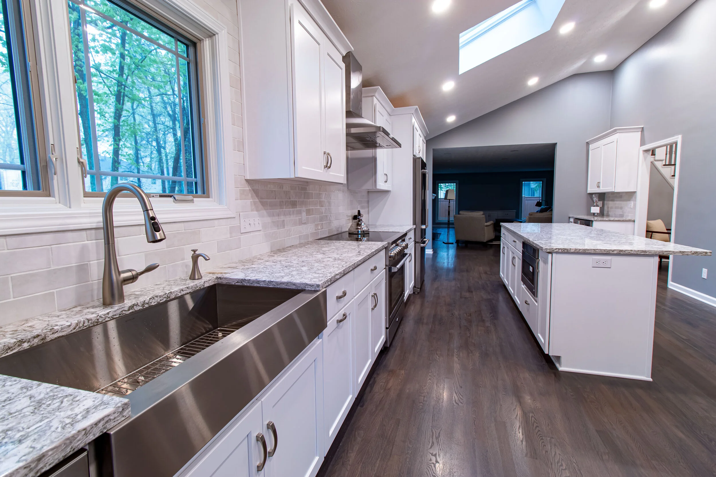
At the request of the homeowner and to create better traffic flow that matches the way they use the space, the kitchen was moved to an entirely one wall design. This allowed to accommodate a large island with seating as well as a small dining table, both of which can be utilized without obstructing the walkway of the kitchen work area. To further improve the flow of traffic, a pocket door was installed in the laundry room to eliminate obstruction.
Addition of eating area.
By expanding the kitchen into the dining room, there was now the need to create a new dine-in/seating space. The addition of a kitchen island along with a small dining area resting on the West end of the home met this need. This provided ample space for dining on the go as well as the occasional family sit-down or entertaining large gatherings.
Updated appearance.
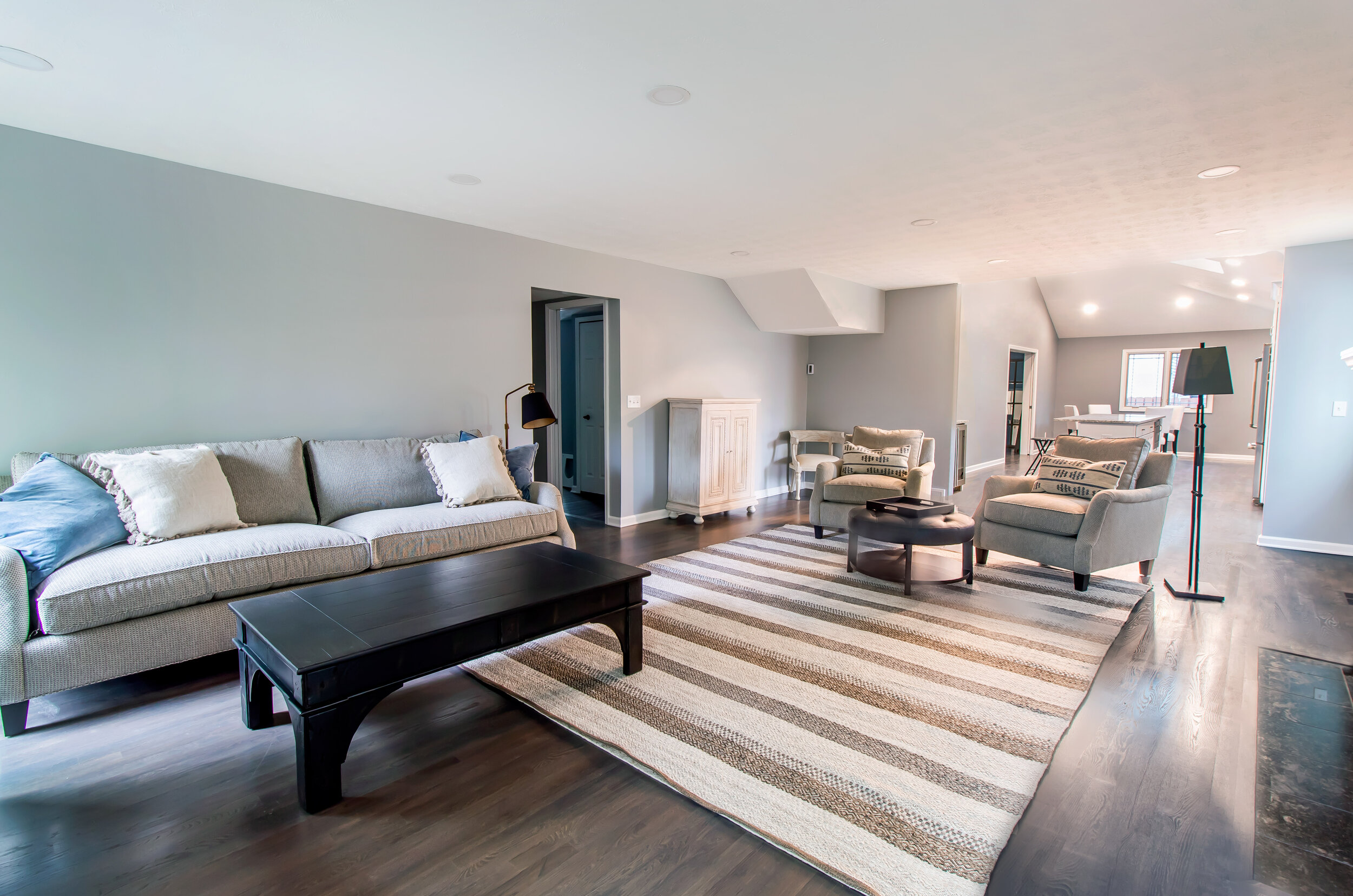
The desire of the homeowner was to overall create an updated aesthetic appearance throughout the first floor. Aesthetic updates included removal of the outdated archway, trendy colors, wood flooring throughout the entire space, new countertops and cabinetry with crown molding, and a counter to ceiling backsplash with stainless steel appliances. Updates throughout the rest of the space included built-in cabinets in the living room, new and up to date windows, French doors and pocket doors.
Effective Storage Solutions.
In the kitchen, a microwave drawer was installed along with additional drawers in the island. For added organization, pull out drawers were also installed near the refrigerator. A separate dry bar was added with a mini fridge for drinks such as wine or beer, which also was accompanied by cabinetry for snacks and other items that need to be at arm's length.
The custom built cabinet in the living room provided additional storage as a space for the TV, cables, and other electronics. Improved Lighting throughout. New LED can lights were installed throughout the first floor, providing ample lighting and adding dynamic and warmth to the space. The LED can lights provide energy efficient lighting solutions while remaining sleek and effective.
Increased natural lighting.
To fully take advantage of the sun, the kitchen sink was moved to the western side of the room under a large window and the existing skylight was to remain. The dining area was then planned around a western facing window to avoid blinding morning light when eating breakfast. Swapping the partial view door leading to the patio with a new sliding glass door further brings in ample natural light. To make use of the morning sun, two extra tall windows were added between the built-in cabinetry to allow for proper light distribution. With the placement of these windows facing East, this also avoided the glare of the evening sun on the TV when relaxing after school or work.
Dedicated space for entertaining and for privacy.
While having a partial open concept was important for the homeowner, having private space was equally important. To address this, pocket doors were installed between the family room and kitchen, successfully creating an open kitchen and living area while maintaining a private family room that can easily be closed off when needed for friends or a quiet place to do homework or read a book.
A New Beginning
Despite a semi-open concept, the new family room still offers the option for privacy with a set of pocket doors to easily close off from the kitchen when necessary. The final plan is a perfect solution to cater to the needs of the homeowner and have effectively solved the daily pain points of living with a large family.


